
2017 – current
Athena Abrasives
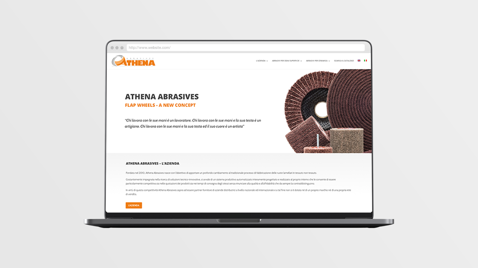
Website, catalogue, branding and photos
Athena Abrasivi (Athena Abrasives) already had a corporate image, so we had to focus on revising that image’s colour scheme and formal style, in order to expand them and adapt them to the company’s product catalogue and website. The result is coordinated and lively and makes it easy for the user to find what he’s looking for.

The user looks for something. The user finds it.
User experience is based on a few, clear concepts. This website’s users are professionals in this sector, and it’s easier for them to recognise a product from its shape rather than from its description. In Athena’s international website, everything revolves around the shared language of photography.
What Athena Abrasives needed the most was having a tool that could enable them to show their products and that was also easy to browse. Therefore, we worked on neatness and functionality. Sharp colour was used to accentuate and convey the most important messages, while giving them personality.
Images
We took all the products’ photographs ourselves: we tried to go beyond providing simple captions and showed Athena’s products in all their detail with a few shots instead. As a result, we were able to bring vivacity and, at the same time, we showed a different side of these products, enabling the reader to better compare different types of products.


Related projects


Find your inner llama!
If you're ready for your transformation, or if you'd like more information on our potion's recipe...